
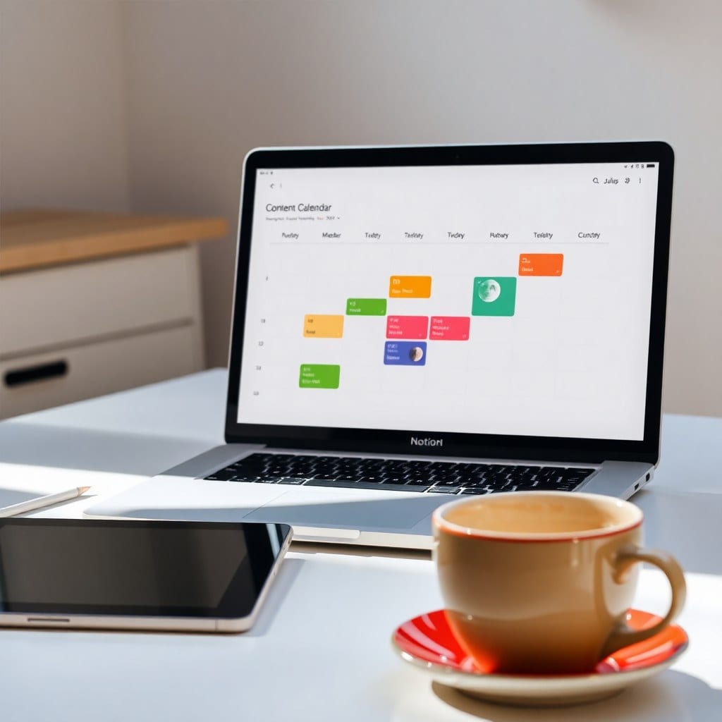
Most Notion dashboards die in week two. You spend a weekend dragging databases into columns, picking a cover image, and feeling productive. Then Monday hits, and you never open it again. I’ve done this at least six times. The problem isn’t Notion. The problem is that you built a dashboard for the person you wish you were, not the person who actually shows up at 10pm with three ideas and no energy.
So let’s build one that works for the real you. I’ll use a freelance illustrator as an example, but the same logic applies to writers, designers, coaches, and anyone running a small creative business.
Start with one question: what do you need to see in the first five seconds? For my illustrator friend, it was: what am I working on today, what’s due this week, and where do I put new ideas? That’s three things. Not ten. The temptation is to add a habit tracker, a reading list, a CRM, and a mood board on the same page. Don’t. Your dashboard is a cockpit, not a warehouse.
Build a ‘Today’ view first. Create a database called Tasks. Add a date property and a status property with just three options: Not started, In progress, Done. Then make a view filtered to ‘Date is Today’ and sort by status. That’s it. Put that view at the top of your dashboard. When you open Notion, you see today. Nothing else competes.
Next, add a ‘This Week’ view. Same database, filter to ‘Date is within this week,’ and group by day. This gives you a runway without overwhelming you. I like to put this in a toggle so it’s one click away but not staring at me. The key is that it’s the same data, just a different lens. You’re not maintaining two systems.
Now add a capture box. This is the part most people skip, and it’s why their dashboard fails. You need a frictionless place to throw ideas, links, and half-thoughts. Create a database called Inbox with just a title and a created time. Put it in the sidebar. On your dashboard, add a linked view of Inbox filtered to ‘Created time is today.’ When you have an idea, you dump it there. Later, you process it. No tagging, no categorizing in the moment. Just capture.
Here’s where the aesthetics come in. You’re design-conscious, and that’s not a flaw—it’s a feature. But aesthetics should serve clarity. Choose one accent color and use it for your primary action—like the Today view header. Use a soft background color for the page, maybe a muted lavender or deep navy. Add a simple icon. Don’t use ten emoji. Don’t use a cover image that makes text hard to read. The goal is calm, not cluttered.
I like to add a ‘North Star’ section at the bottom of the dashboard. This is one line about what you’re building this quarter. For the illustrator, it was: ‘Land three children’s book clients by June.’ That single sentence keeps the tasks from feeling random. When you’re tired, you can look at it and remember why you’re doing any of this.
One more thing: review your dashboard every Friday for ten minutes. Delete views you haven’t clicked in two weeks. Archive tasks that are stale. Add one thing that would make next week easier. This tiny ritual is what keeps the dashboard alive. Without it, entropy wins.
If you want a head start, our Creative Solopreneur OS template includes this exact structure—Today, This Week, Inbox, and North Star—plus a project database and a simple client tracker. You can duplicate it and have a working dashboard in five minutes. But even if you build from scratch, remember: fewer views, clearer focus, and a capture box that’s always one click away.