
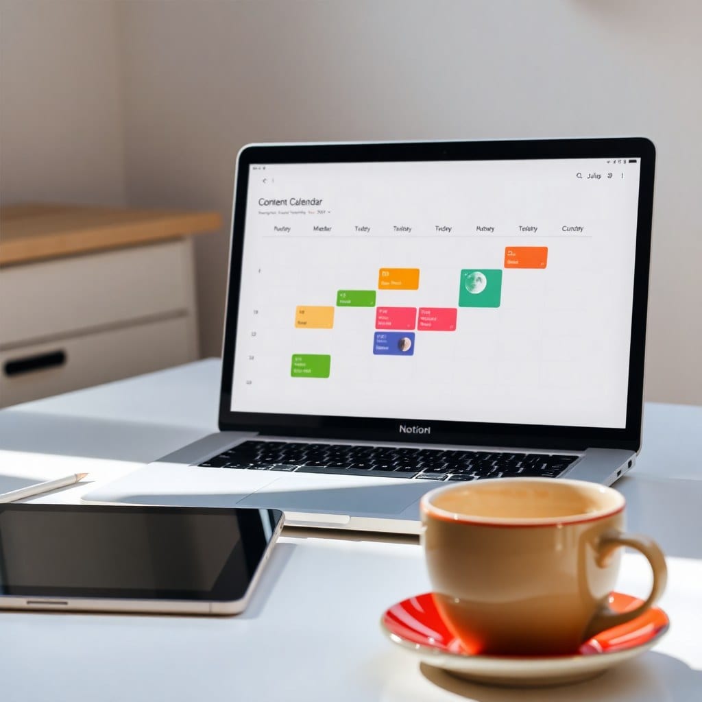
Most Notion dashboards look like a spreadsheet had a panic attack. They’re crammed with databases, checkboxes, and enough red overdue tags to make you want to close the app forever. But your dashboard is the first thing you see when you sit down to work—it should feel like a deep breath, not a slap in the face.
When I built my first Notion dashboard, I copied a popular template that had 12 different linked databases, a habit tracker, a goal planner, and a water intake log. It was impressive. It was also completely unusable. I spent more time maintaining the system than doing actual work. The turning point came when I realized that a dashboard isn’t a command center; it’s a compass. It should point you in the right direction, not map every possible route.
So, how do you build a dashboard that sparks joy? Start with a single question: What do I need to see to feel grounded today? For me, that’s three things: my top three priorities for the day, a quick capture inbox for stray thoughts, and a gentle reminder of my current projects. That’s it. Everything else lives elsewhere.
The layout matters as much as the content. Use columns to create visual breathing room. Put your most important element—usually your daily focus—front and center. Use a callout block with a soft color to house your intention for the day. I like to add a moon phase icon that changes weekly, just for a touch of whimsy. It’s a small ritual that signals to my brain: we’re in creative mode now.
Don’t underestimate the power of white space. In Notion, that means avoiding the temptation to fill every inch. Group related items into toggles so you can expand when needed. Use dividers sparingly. And for the love of all things holy, don’t put a giant database of every task you’ve ever thought of on your dashboard. That’s what your task database is for—link to a filtered view instead.
Another trap is over-automation. I once set up a series of buttons and rollups that automatically calculated my weekly progress. It was cool for about three days, until a formula broke and I spent two hours debugging it. Now I keep it simple: a manual progress bar that I update at the end of each week. It’s tactile and satisfying, like crossing off items on a paper list.
Your dashboard should also reflect your energy rhythms. If you’re a morning person, put your most demanding work front and center. If you’re a night owl, maybe your dashboard leads with a gentle journal prompt and a playlist link. I have a client who starts her day with a ‘moon check-in’—a simple prompt asking how she’s feeling. Based on her answer, she clicks a button that filters her tasks to match her energy. That’s the kind of personalization that makes a system stick.
The aesthetics are not frivolous. When something looks good, you want to use it. I’m not saying you need to spend hours choosing the perfect cover image, but a cohesive color palette and a couple of well-placed icons can transform a utilitarian page into a space you enjoy. I use a muted palette of lavender, sage, and warm gray—it feels like moonlight on a quiet night. Find colors that make you feel calm and focused.
Finally, remember that your dashboard will evolve. What works for you in January might not work in June. That’s okay. Set a monthly reminder to review your dashboard. Ask yourself: Is this still serving me? If not, change it. The beauty of Notion is that it’s malleable. Your dashboard should be a living document, not a monument.
If you’re starting from scratch, begin with a blank page and add one element at a time. Resist the urge to download a 50-database template. Instead, build something that feels like you. And if you want a head start, our Luna Life Dashboard template is designed with these principles in mind—it’s minimal, beautiful, and flexible enough to make your own. Because at the end of the day, the best system is the one you’ll actually use.