
People often ask us why our Notion templates feel different—more polished, more inviting. The answer isn’t a secret formula; it’s a careful design process that balances aesthetics with usability. In this post, I’m pulling back the curtain on how we create templates that people actually love to open every day.
It starts with the color palette. We avoid the harsh, high-contrast colors that dominate many productivity tools. Instead, we choose soft, muted tones inspired by the moon and night sky—lavenders, dusty blues, warm creams. These colors are easier on the eyes and create a sense of calm. When you’re staring at a screen for hours, that matters more than you’d think.
Next, we think about typography. Notion’s default fonts are fine, but they’re generic. We switch to fonts that have personality—serif for headings, sans-serif for body text. This adds a layer of warmth and professionalism. We also use callout boxes and icons strategically to break up text and guide your eye to the important parts. Icons are especially useful; a simple emoji or an SVG icon can make a page feel friendly and approachable.
Layout is where many templates fail. They try to pack too much into one view, creating visual chaos. Our rule of thumb: one page, one purpose. The home dashboard has a simple two-column layout with a main area for your priorities and a side column for links and inspiration. Project pages have a clean table with just the essential fields. Every element has a reason to exist; if it doesn’t add value, we cut it.
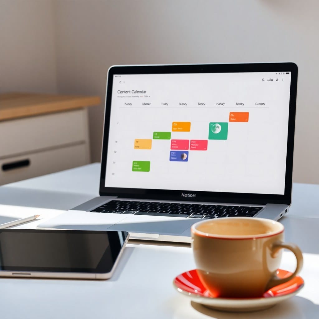
We also design for flexibility. Creative work is unpredictable, so our templates include options for different views—board, calendar, gallery—and allow you to add custom properties without breaking the system. For instance, our content calendar template lets you switch between a week view and a month view, and you can add tags for content type or platform. This adaptability means the template grows with you, not the other way around.
Another secret is the use of “soft guides”—small text or subtle icons that nudge you to use the template effectively. For example, in our project tracker, we include a column called “Next Action” with a note like “What’s the one thing to do next?” This helps you stay focused without feeling lectured. It’s like having a supportive friend who checks in.
We also test our templates with real users. Before we launch, we ask a small group of creative solopreneurs to use the template for a week and give feedback. We watch how they interact, where they get confused, and what they love. This feedback loop is invaluable. It’s why our templates feel intuitive rather than flashy.
Finally, we obsess over the little details: consistent spacing, aligned columns, and proper contrast. These might seem minor, but they make a huge difference in how the template feels. When you open a page and everything is harmonious, you instantly feel more at ease—and you’re more likely to use it consistently.
If you want to apply these principles to your own Notion workspace, start by auditing your existing setup. Ask yourself: Does this page have a clear purpose? Is the color palette calming? Can I find what I need in under ten seconds? If not, it’s time for a redesign. And if you’d rather skip the DIY, our templates have all these secrets baked in. You can grab one and start feeling organized today.