
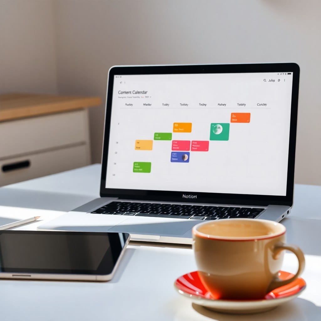
When I tell people I design Notion templates for a living, I often get one of two reactions: either ‘That’s a thing?’ or ‘Oh, I’ve always wanted to make my own!’ Both are valid. But the truth is, designing a template that people actually use — and love — is a lot more involved than dragging and dropping some databases. It’s a blend of psychology, design, and a whole lot of iteration. Today, I’m pulling back the curtain on how we create the templates in the Luna Makes Shop, from the first spark of an idea to the final release. And yes, I’ll share the ugly parts too.
Every template starts with a problem. Not a hypothetical problem, but one I’ve experienced myself or heard repeatedly from our community. For example, our ‘Creative Project Hub’ was born out of my own frustration with juggling client work, personal projects, and admin tasks. I was using five different apps and still missing deadlines. So I started sketching a solution in Notion. I spent a week just experimenting with different layouts, properties, and views. I didn’t worry about aesthetics yet — just functionality. I asked myself: What information do I need at a glance? What actions do I take most often? How can I reduce friction? This phase is messy. I create duplicate pages, rename things, and sometimes start over completely. It’s not pretty, but it’s necessary.
Once I have a rough functional prototype, I test it on myself for at least two weeks. This is crucial. A template might look great in theory, but if it’s not intuitive after a few days, it’s not ready. I keep a running list of pain points: ‘Too many clicks to add a task,’ ‘Hard to see what’s due today,’ ‘Client info is buried.’ Then I iterate. I simplify. I remove properties that I thought were essential but never used. I add quick-add buttons and filtered views. I also pay attention to how it feels emotionally. Does opening this page make me feel calm or anxious? If it’s the latter, something’s off.
After the solo test, I bring in a small group of beta testers — usually 5 to 10 people from our community who represent our audience: designers, writers, coaches, and side-hustlers. They get early access for free in exchange for honest feedback. I ask them to use it for a week and then fill out a survey. The feedback is often humbling. Things I thought were obvious are confusing. Features I loved are ignored. But that’s the point. I take notes, then I make changes. Sometimes I have to kill a feature I spent hours on. That’s okay. The goal is a template that works for many, not just for me.
Design comes next. This is where we lean into the ‘luna’ aesthetic: soft, moonlit, dreamy but practical. I choose a color palette that’s easy on the eyes — usually muted blues, purples, and warm neutrals. I use consistent icons (we have a custom set) and keep the layout clean. I add subtle touches like a moon phase tracker for monthly planning or a gentle quote at the top of a dashboard. But I’m careful not to let aesthetics compromise usability. A pretty template that’s hard to navigate is a failure. So I test the design with fresh eyes. Can someone find what they need in three clicks or less? If not, I simplify.
Then comes the documentation. Every template comes with a setup guide, but I try to make it as minimal as possible. I include a short Loom video (under five minutes) that walks through the main features, plus a text-based FAQ. I also add tooltips inside the template itself — small callouts that explain what a property does. The goal is for someone to be able to set up the template in under 15 minutes without needing to email support. That’s not always achievable, but it’s the target.
Finally, we release. But even after release, the work isn’t done. We monitor support requests and feedback. If multiple people ask the same question, we update the documentation. If a feature is consistently unused, we consider removing it in a future update. We also add new features based on requests. For example, our ‘Content Calendar’ template now includes a ‘Repurposing’ section because so many users asked for it. All updates are free for existing customers. That’s our promise: you buy once, and you get every improvement we make, forever.
Of course, not every template is a hit. We’ve had a few that flopped. One was a ‘Mood Board’ template that was too niche and didn’t solve a clear problem. Another was a ‘Finance Tracker’ that was too complex for our audience. We learned from those. Now we validate ideas more thoroughly before building. We ask: Is this a problem our audience actually has? Can we solve it in a way that’s uniquely Luna? If not, we move on. It’s better to release fewer, better templates than to flood the shop with mediocre ones.
So there you have it: a peek behind the curtain. It’s not glamorous. It involves a lot of tinkering, testing, and throwing away work. But when we get it right — when someone tells us that our template helped them land a client or finally finish their novel — it’s all worth it. If you’re thinking of building your own template, my advice is to start with a problem you know intimately. Build for yourself first. Then share it. And don’t be afraid to iterate. The best templates are never finished; they evolve. Just like us.