
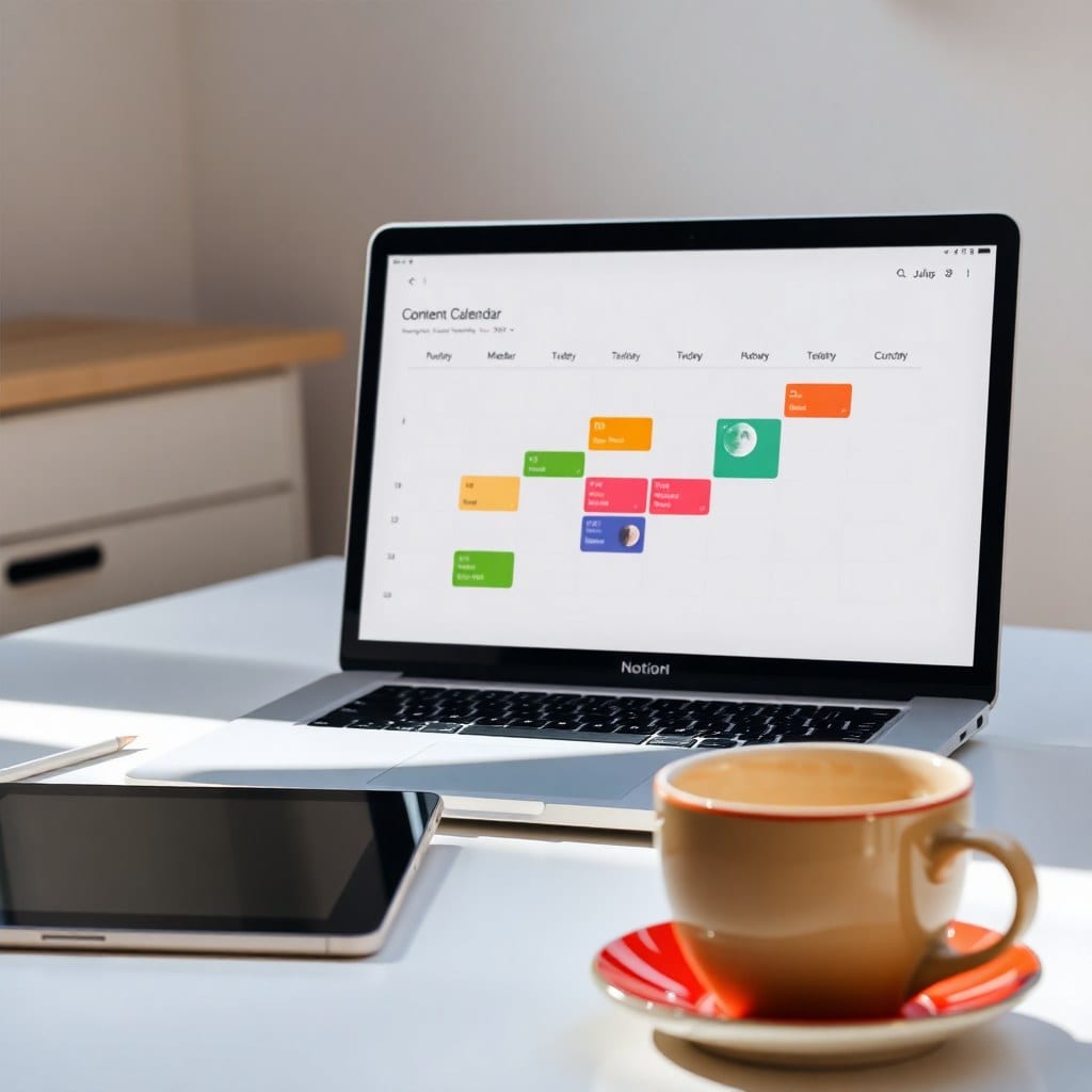
Most Notion dashboards start with good intentions. You spend a weekend watching YouTube tutorials, adding databases, linking views, and tweaking colors. By Sunday night, you have a masterpiece. By Wednesday, you’re avoiding it because it feels like a second job.
The problem isn’t Notion. It’s that we design dashboards for the person we wish we were—the one who reviews every task daily and maintains a perfect inbox. The real you needs something that forgives a missed day and still feels inviting to open.
So let’s talk about designing a dashboard that sparks joy, not guilt. The first principle is to start with a single question: What do I need to see first thing in the morning? Not everything. Just the first thing. For a freelance writer, that might be today’s deadline. For a designer, it might be the current client project. For a side-hustler, it might be the one task that moves the needle. Your dashboard should answer that question in under five seconds.
That means your most important database view goes at the very top. Not a gallery of inspirational quotes. Not a linked view of your entire task list. Just the essential. In our Luna templates, we call this the “North Star” section. It’s usually a filtered view showing only items due today or flagged as high priority. Everything else can live below the fold.
Next, embrace negative space. Notion gives you the ability to cram infinite widgets onto a page, but that doesn’t mean you should. White space is not wasted space—it’s breathing room for your brain. A cluttered dashboard triggers the same fight-or-flight response as a cluttered desk. So leave margins. Use columns sparingly. Let your eyes rest.
Color is another tool, not a decoration. A soft palette reduces cognitive load. Think muted pastels, not neon highlights. If you’re using color to indicate status, stick to three: one for urgent, one for in-progress, one for done. More than that and you’re creating a rainbow of anxiety.
Now, let’s talk about the ‘joy’ part. Joy in a dashboard often comes from small, delightful details. Maybe it’s a daily affirmation that rotates automatically using a formula. Maybe it’s a progress bar that fills up as you complete tasks. Maybe it’s a simple emoji that changes based on the day of the week. These micro-interactions make your dashboard feel alive and personal.
But don’t overdo it. The goal is to reduce friction, not add novelty. If you find yourself spending more time tweaking your dashboard than using it, that’s a sign to step back. A good dashboard is like a good pair of jeans—it should feel comfortable and require zero thought.
Another common mistake is treating your dashboard as a catch-all. It’s not a filing cabinet. It’s a control panel. Only the most actionable information belongs there. Everything else—meeting notes, research, archived projects—should live in separate pages. Link to them if needed, but keep the dashboard lean.
Finally, design for your energy levels. Some days you’ll have the focus to tackle deep work. Other days you’ll be lucky to answer emails. Your dashboard can accommodate both by having a ‘low-energy’ view that surfaces simple tasks. This is especially helpful for creative solopreneurs who ride waves of inspiration and burnout.
Remember, your dashboard is a living document. It should evolve as you do. Set a monthly reminder to review it. Ask yourself: What’s working? What’s ignored? What can be removed? Then make one small change. Over time, you’ll end up with a dashboard that feels like a true extension of your mind—calm, clear, and ready to help you shine.