
Most Notion dashboards fail because they’re too complex. Here’s a simple, repeatable framework for building one you’ll open every day.
I’ve built dozens of Notion dashboards for myself and for clients. The ones that stick are never the ones with the most databases or the fanciest formulas. They’re the ones that answer one question the moment you open them: what should I do next? If your dashboard doesn’t answer that, it’s just decoration.
Start with a single column. Seriously. The biggest mistake I see is people creating a three-column layout with ten linked databases before they’ve even used the system for a week. Instead, build a dashboard with one main section: Today. That section should show only what’s due today or what you’ve explicitly marked as a priority. Everything else lives elsewhere. This forces you to confront your actual workload, not a fantasy version of it.
Next, add a “Quick Capture” area. This is a simple input field or a linked database view where you can dump a thought in two seconds. The goal is to reduce friction for capturing ideas, tasks, and random notes. I use a single database called “Inbox” with a filter that shows only unprocessed items. Every morning, I spend five minutes processing that inbox into my projects or calendar. Without this, ideas evaporate.
The third piece is a “Projects” overview. But here’s the key: don’t show all your projects. Show only active ones. I have a status property called “State” with options like Active, Someday, Done. My dashboard view filters to Active only. This keeps me focused on what’s actually moving. When I finish a project, I change its state and it disappears from the dashboard. That small action feels like a win.
Now, aesthetics matter. A dashboard you enjoy looking at is a dashboard you’ll return to. Choose a cover image that makes you feel calm or inspired. Use a consistent icon set. I like to use simple line icons in a muted color palette. Add a quote or a moon phase widget if that’s your thing. But don’t let decoration delay function. Build the structure first, then make it pretty.
One of the most common questions I get is about databases versus pages. For a dashboard, you don’t need many databases. I use three: Inbox, Projects, and Tasks. Tasks are linked to Projects via a relation. That’s it. This minimal setup is powerful enough for most solopreneurs. If you’re a team, you might add a People database, but for solo work, keep it lean.
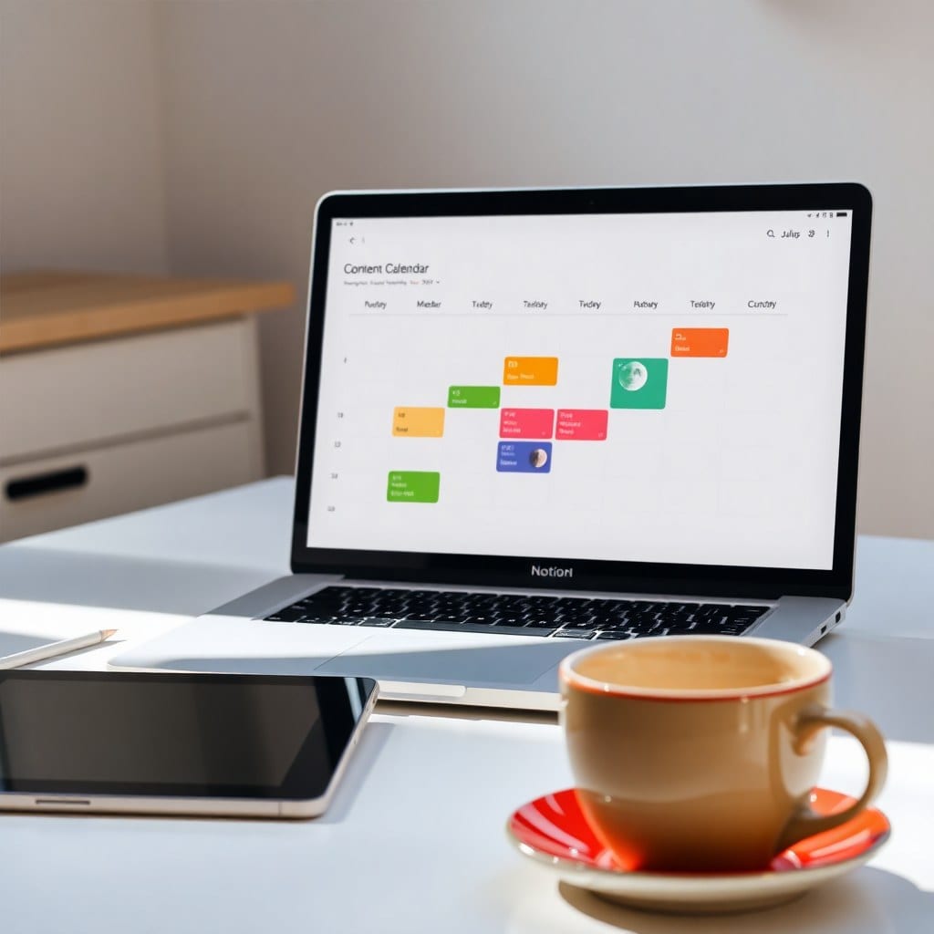
Another tip: use filtered views instead of separate databases. For example, instead of creating a new database for “Content Calendar,” just create a filtered view of your Tasks database where the Category is Content. This reduces duplication and keeps your data in one place. It also makes it easier to change properties later.
What about goals and habits? Those can be separate databases if you want to track them daily, but they don’t need to be on your main dashboard. I have a separate “Habits” page that I visit once a day. The dashboard is for work, not for everything. This separation helps me switch modes.
Finally, review your dashboard weekly. Every Sunday, I look at my dashboard and ask: is this still serving me? If a section hasn’t been touched in two weeks, I remove it. Dashboards are living documents. They should evolve as your work does. Don’t be afraid to delete things. A cluttered dashboard is a sign you’re holding onto outdated priorities.
If you’re short on time, start with a template. Our Luna Dashboard template is built exactly on this framework: one column, three databases, and a focus on what’s next. You can duplicate it and have a working dashboard in five minutes. Then customize it over time. The best system is the one you’ll actually use—and that starts with simplicity.