
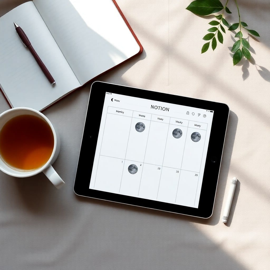
When people see our templates for the first time, they usually say the same thing: ‘This is so pretty.’ And it is. But what they don’t see is the hours of thinking, sketching, and iterating that go into making a template that’s not just beautiful, but genuinely useful.
I’m lifting the curtain today to share how we design templates at Luna Makes Shop. It’s a process that blends intuition with a lot of trial and error.
## It starts with a feeling
Every template begins with a vibe. For the Content Planner, it was ‘calm yet productive.’ For the Client Portal, it was ‘welcoming but professional.’ We translate that vibe into a color palette and typography choices early on, because those set the emotional tone.
But aesthetics are only half the equation. We ask: What’s the core problem this template solves? For the Content Planner, it was the overwhelm of managing multiple platforms. For the Client Portal, it was the chaos of scattered client info. Once we have that, we can build features around it.
## Mapping the user journey
Next, we map out the user’s journey. We think about the first time someone opens the template. What do they see? What’s the first thing they want to do? We design the dashboard to be intuitive, so even a Notion newbie doesn’t feel lost.
We use placeholders and sample data to show how things work. For example, in the Content Planner, we include mock blog post entries and social media prompts. That way, you can see how it’s supposed to look before you dive in. It’s like a coloring book with the colors already filled in — you can follow the pattern or make it your own.
## The nitty-gritty: databases, relations, and formulas
This is where the magic happens. Behind that pretty front page is a web of linked databases, rollups, and formulas that make the template actually function.
Take the Content Planner. It has a database for content pieces, one for platforms, and one for campaigns. They’re all connected so you can filter by project or status. We use rollups to show engagement metrics right on the dashboard — no manual updating needed. It took about 20 iterations to get the formulas right, but now it’s effortless.
We also obsess over the little details. Buttons that open the right view, property types that are actually useful (like ‘date’ for deadlines, not just text), and views that make sense for different tasks. If something doesn’t add value, we cut it.
## Testing with real users
Before we launch a template, we test it. Not just with productivity nerds, but with real creative solopreneurs who might not be Notion experts. We watch how they interact with the template, where they get stuck, and what they ignore.
This has led to some important changes. For example, in our Finance Tracker, users kept missing the ‘recurring expenses’ option. We moved it to the top and added a visual cue. Small tweaks like that make a big difference.
We also ask for feedback after launch. Our best updates have come from user suggestions. One user asked for a ‘weekly review’ page in the Content Planner, and we added it in the next version. That’s why we offer lifetime updates — we’re always refining.
## The joy of a finished template
When we finally hit ‘publish,’ it’s a mix of relief and excitement. We’ve poured our hearts into making something that will help someone else feel more organized and creative. And when we hear from customers who say it changed their workflow, that’s the best reward.
So next time you see a pretty template, know that there’s a whole process behind it — a process that’s part art, part science, and a whole lot of love. And if you ever wonder why we do what we do, it’s simple: we want to make productivity feel a little more human, and a little more magical.