
When I first started using Notion, I was overwhelmed by the blank pages. There was so much possibility, but also so much pressure to make it perfect. I’d spend hours creating beautiful dashboards, only to abandon them a week later because they were too rigid or too complicated. That’s when I realized the key to a good template isn’t just aesthetics—it’s about building a flexible system that adapts to real life.
Now, as the person behind Luna Makes Shop, I’ve developed a design philosophy that I apply to every template. It starts with empathy: I think about the messy, chaotic moments when my users will open the template. They’re tired, they’re juggling a million things, and they need clarity fast. So I design for that moment. Every template begins with a skeleton of core databases and views, but I leave plenty of room for customization.
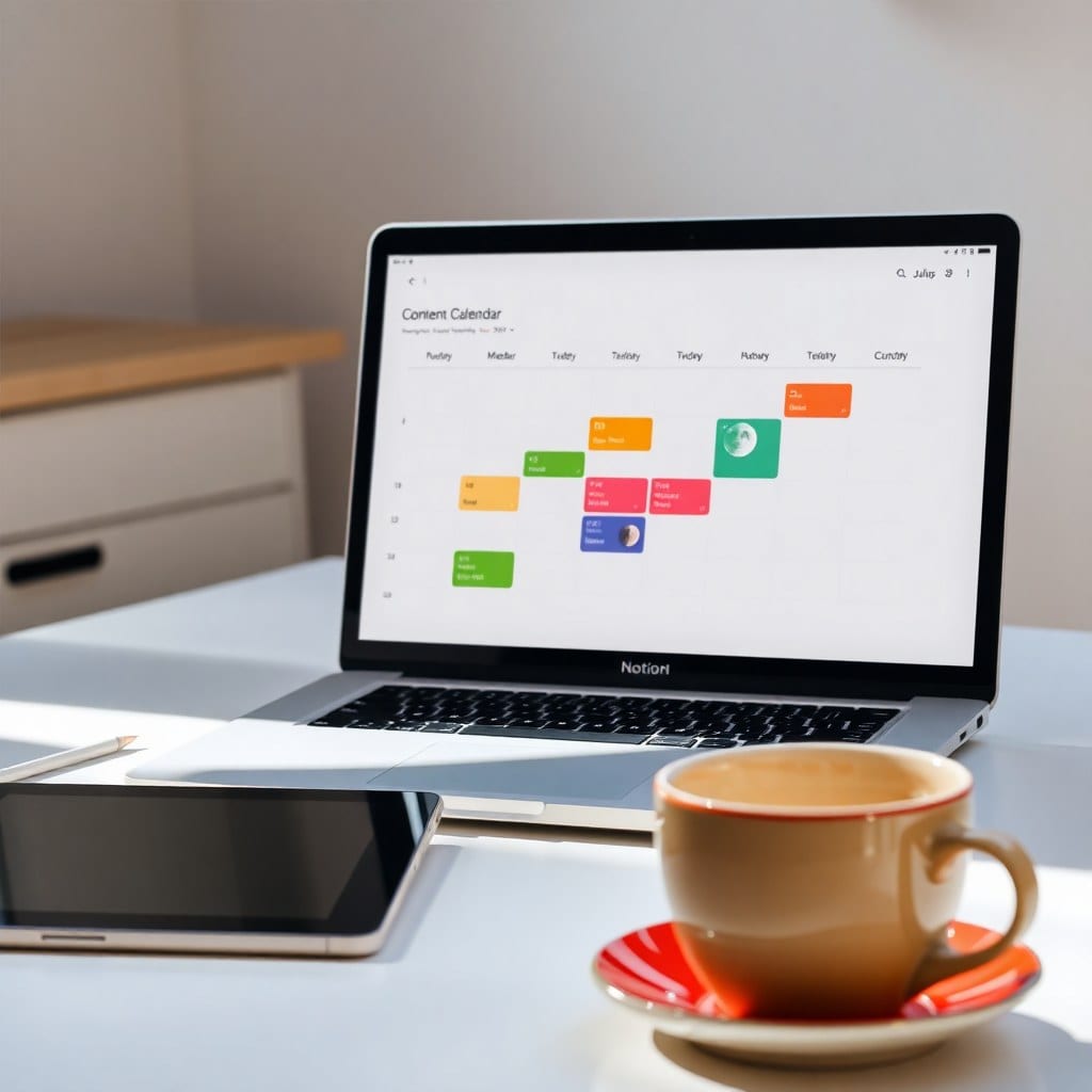
One of the biggest lessons I’ve learned is that less is often more. In the early days, I’d cram every possible feature into a template—trackers, habit logs, mood boards, you name it. But that just created clutter. Now, I focus on the essential elements that will actually get used. For example, my Content Planner template has just four databases: Content Ideas, Editorial Calendar, Assets, and Analytics. That’s it. But each one is thoughtfully connected, so you can see your entire pipeline at a glance.
The magic also lies in the details. I spend a lot of time on property types, relation options, and formulas. A template that automatically calculates your post frequency or shows a progress bar for your quarterly goals feels like magic, but it’s really just thoughtful back-end work. I also obsess over the empty states—what does the user see when they first duplicate the template? I want them to feel welcomed, not intimidated. So I include example entries and helpful tips right inside the template.
Another lesson? Test, test, test. I use every template myself for at least a month before I release it. That’s how I discovered that my original Client Hub had too many statuses. Clients didn’t know whether to mark a project ‘In Progress’ or ‘On Hold,’ so they’d just leave it blank. I streamlined the statuses to just five clear options, and suddenly the whole system worked better.
I also listen closely to feedback from my customers. One of my favorite updates came from a user who suggested adding a ‘Pause’ status for projects that are on the back burner. That small change made the template feel more human because not everything is always moving forward. It’s okay to pause.
This behind-the-scenes look is my way of showing that templates aren’t just digital products—they’re tools for making life a little easier. When you buy a template from Luna, you’re not just getting a file. You’re getting a system that’s been crafted with care, tested in real life, and refined based on real feedback. And it will keep getting better with updates, just like the moon keeps cycling.
So next time you open a Notion template and think, ‘Wow, this just works,’ remember that it didn’t happen by accident. It took patience, iteration, and a deep understanding of what creative people need. And that’s the kind of magic I’m happy to share.