
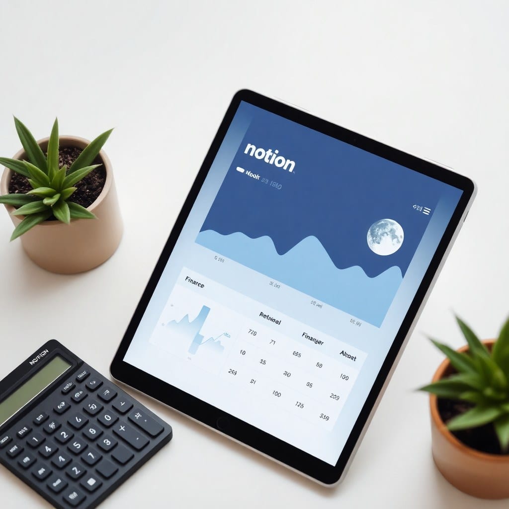
There’s a secret to a great Notion template: it should feel like magic. You open it, and everything is exactly where you need it to be. The colors are soothing, the layouts make sense, and you instantly feel more organized. But that magic doesn’t happen by accident. It’s the result of careful design decisions.
In this post, I’m pulling back the curtain on how we design templates at Luna Makes Shop. Whether you’re a Notion newbie or a power user, you’ll learn principles you can apply to your own setup.
First, we start with the user’s emotional state. A creative solopreneur is often overwhelmed, juggling multiple projects and roles. Our goal is to create a sense of calm. That’s why we use soft, muted color palettes—think dusty pinks, sage greens, and warm neutrals. These colors are easy on the eyes and evoke a soothing, moonlit vibe. We avoid harsh contrasts and neon accents.
Next, we think about information architecture. What does the user need to see first? For a dashboard, that’s often a daily focus or a list of priorities. We use large, clear typography for headings and keep the layout airy with plenty of whitespace. A cluttered template defeats the purpose.
We also love adding whimsical touches—a tiny moon icon, a playful emoji in a heading, or a whimsical callout box. These small details make the template feel personal and delightful. They’re the equivalent of a handwritten note in a package. That’s what makes people smile when they open their new template.
But beauty is nothing without function. Every template must pass the ‘real life’ test. We ask ourselves: would a busy freelancer actually use this on a Tuesday afternoon? We test our designs by using them for our own projects. If a section feels redundant, we cut it. If a workflow is clunky, we simplify it.
A great example is our Content Calendar template. We realized that many creators struggle with maintaining a consistent posting schedule. So we built in a content bank where you can collect ideas, a planning grid for the month, and a tracker for each piece of content. The result? A system that feels effortless because it’s designed around how creators actually think.
We also pay attention to scalability. A template should work for a beginner just starting out, but also grow with them as their business expands. We use databases that can be filtered and sorted, so you can view your tasks by project, status, or due date. This flexibility is what makes Notion so powerful.
Finally, we never stop iterating. After we ship a template, we watch for feedback from our customers. If someone says a section is confusing, we revise it in the next update. Our templates are living documents—they evolve as our users’ needs change.
Designing a Notion template is a blend of art and psychology. It’s about understanding what makes people feel organized and inspired. When we get it right, it does feel like magic. And that’s the best part of our job.